
The exterior design of View-Master packet envelopes evolved greatly over the years in reponse to marketing needs and changes in company ownership.
Any given packet is likely to have been issued in more than one design style. Collectors have devised a (more or less) standard classification system to identify the various packet styles.
The coding system is originally credited to Bill Wolf, an Allentown Pennsylvania collector, and refined by Walter Sigg, Roger Nazeley and Dalia Miller;
however, collectors, auctioneers, and mail-order sources typically adapt the system to their own needs and inclinations.
The classification system uses a letter/number code to reference the packet style. Below is a list of the codes and packet samples as used in this database, sorted by production in the USA or Belgium.
Only brief descriptions are shown here. More detailed information about each style will be included as separate articles.
S1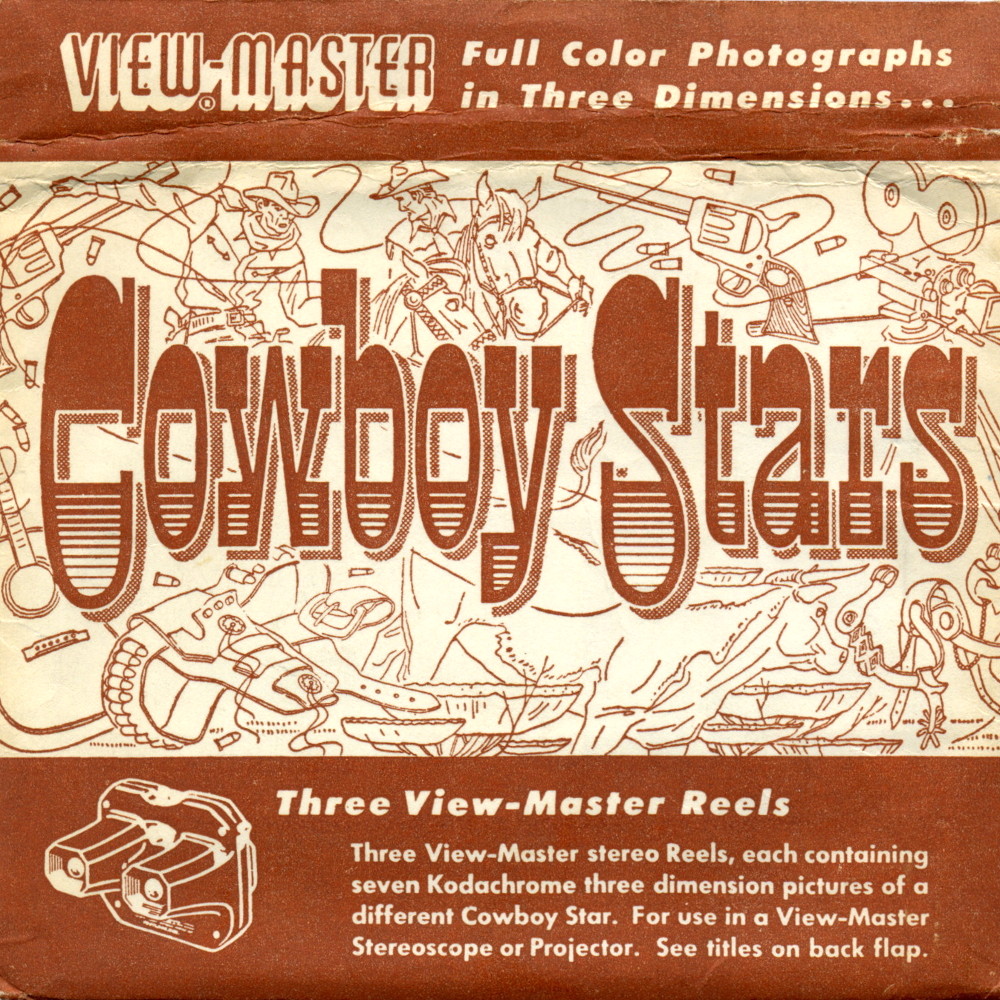
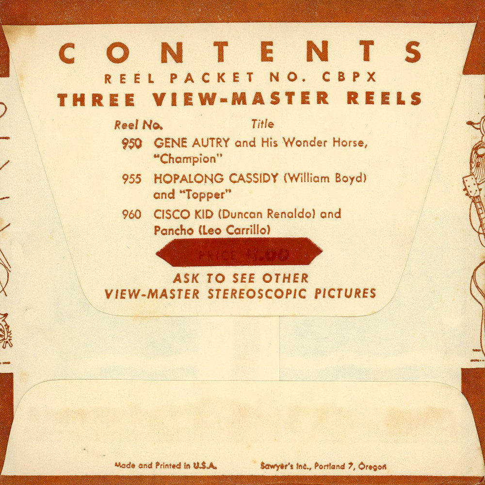
Cowboy StarsThe S1 style, seen in Sawyer's first multi-reel packets, was characterized by monochrome line illustrations on the envelope front.
S1 packet selection Typical covers were composed of solid-color horizontal bands at top and bottom, with line art between. The relative proportions of colored bands and line drawings varied among packets; while some, like The Christmas Story, exhibited an approximate 33%-33%-33% division, others displayed a ratio closer to 20%-60%-20%.
While this three-level layout was the most common design, it was not the only manifestation of the S1 style. The earliest designs, seen in The Christmas Story, Fairy Tales, New Fairy Tales, and Wild Animals, comprised two vertical columns of line art on either side of a central column of text. Other S1 packets displayed full-face line drawings in combination with a single solid-color horizontal band at top or bottom. A new school of thought even classifies the S2 variant as a sub-species of the S1 style. Common elements in all S1 packet covers, however, were a line drawing of a Model "C" View-Master viewer and the art décoratif View-Master logo.
The envelope flap was long, approximately 60% the vertical dimension of the packet, and bore the packet's alphabetic designation (if any) and individual reel numbers.
S2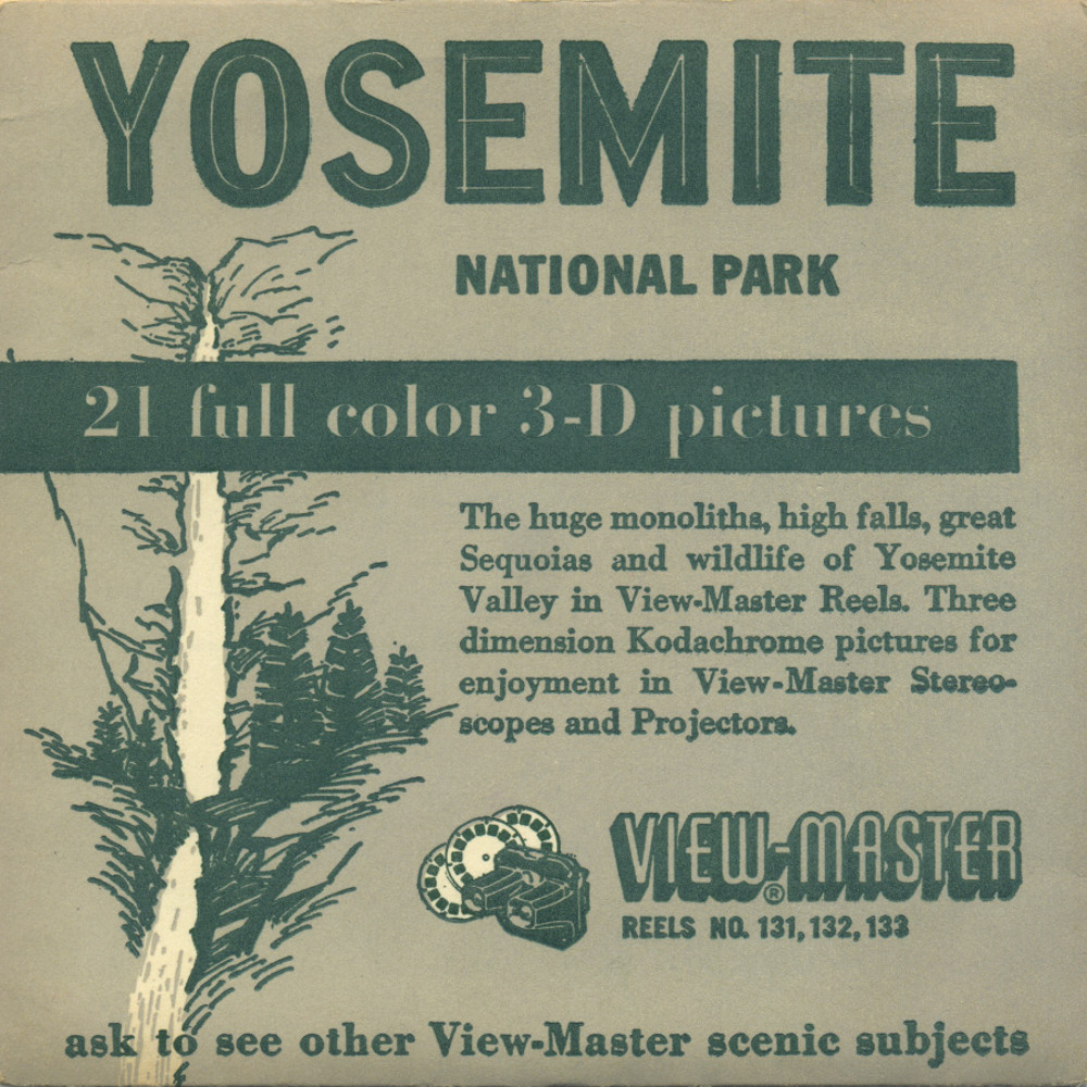
Yosemite National ParkS2 packets shared the use of line drawings with the S1 style, though cover art was simpler and moved into the background. Typography was the principal design element. A narrow, solid-color bar extended from the left edge of the cover, against which the slogan "21 full-color 3-D pictures" was set. The drawing of a Model "C" viewer was carried over from the S1 style, depicted against a background of three View-Master reels. Printing was two-color.
S3D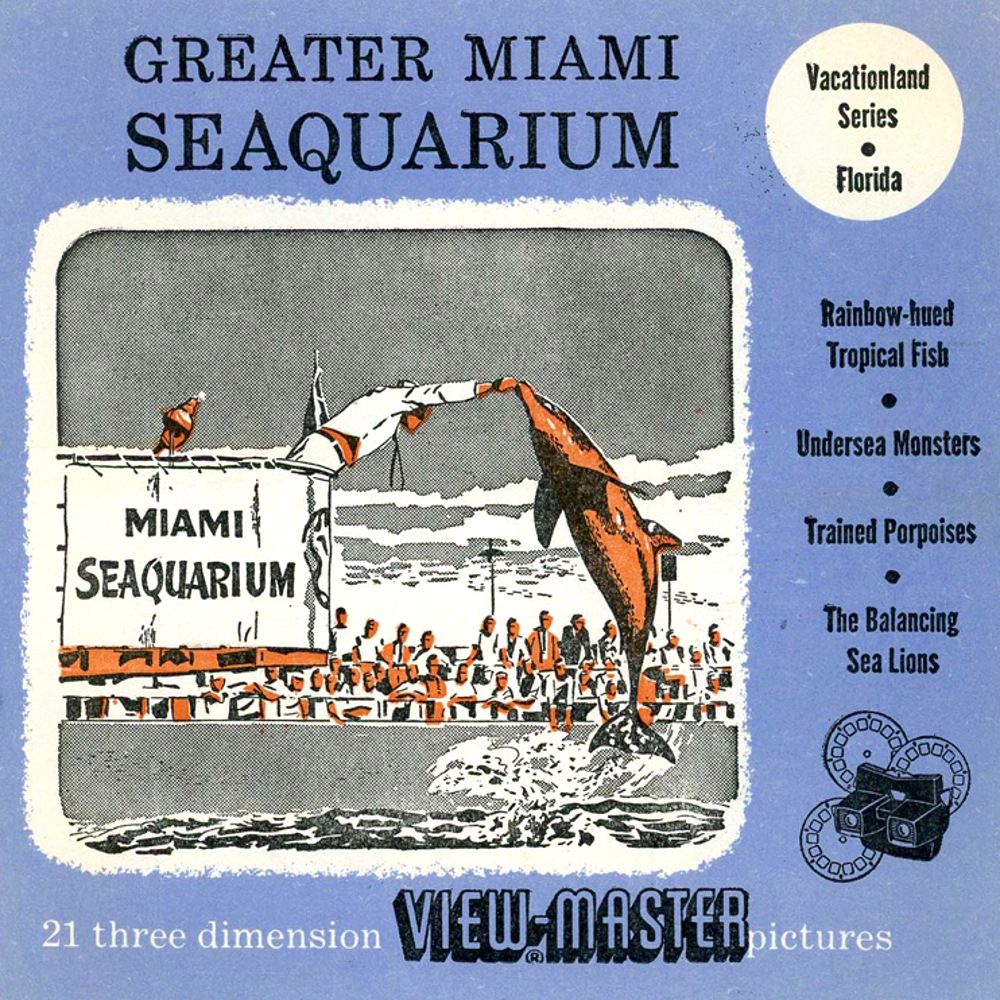
Greater Miami SeaquariumThe S3 style marked the beginning of Sawyer's commitment to the 3-reel packet format as the backbone of their View-Master marketing and production program.
The central element of the S3 design was a large square window with rounded corners, representing an image as seen through a View-Master viewer. Two- or three-color line drawings, like those in previous packet styles, filled this "window" in the earliest S3 packets, which collectors designate "S3D." The use of drawn illustration in the S3 style was short-lived; full-color photographic images soon replaced line art on packet covers to produce what is known today as the standard S3 variant.
The S3 packets also changed the viewer shown on the front cover from the Model "C" to the Model "E".
S3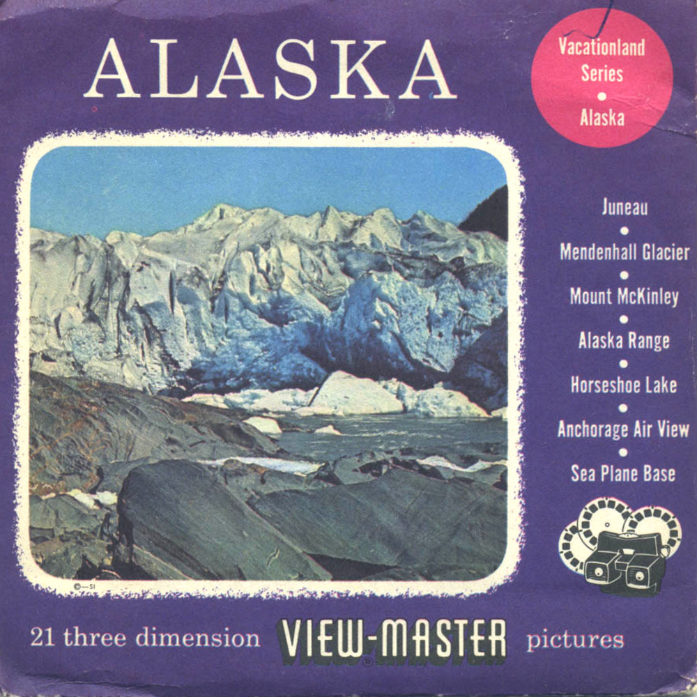
AlaskaThe S3 layout was uniform from packet to packet and consisted of the left-aligned picture window surrounded:
at the top by the packet title;
at the upper right by a solid-color circle displaying a general subject catgory;
at the right by a textual sampling of the packet contents;
at the lower right by a drawing of a View-Master viewer against a background of three reels (initially the Model "C" from S1 and S2 packet designs, but soon changed to a Model "E"); and
at the bottom by the slogan "21 three dimension View-Master pictures" incorporating the original art décoratif View-Master logo.
The back of the packet envelope was laid out for mailing, with "Hand Stamp" and "Do Not Bend" postal cautions and areas reserved for address, return address, and postage stamp. The S3 flap was considerably shorter than those on earlier envelopes, occupying approximately 25% of the packet's vertical dimension.
With S3 production Sawyer's abandoned earlier alphabetic packet designations; numbering was applied instead to the reels themselves. Typically, reels in a packet were assigned a shared number with -A, -B, or -C suffixes appended to differentiate them from one another. For example, the Coney Island packet reels were designated 56-A, 56-B, and 56-C. In the state tour titles, reel designations consisted of the state's alphabetic abbreviation with the suffixes -1, -2, or -3,
such as MASS-1, MASS-2, and MASS-3 for the Massachusetts packet. New numbers notwithstanding, single reels with their original numbers were quite commonly issued in S3 packets. Reel numbers were printed at the top of the envelope flap in earlier S3 issues and below the address block in later issues.
S4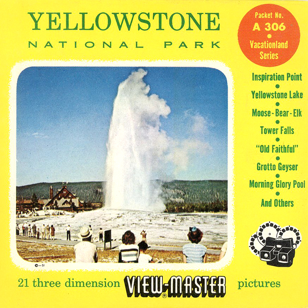
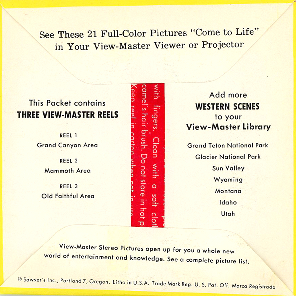
Yellowstone National Park A306The S4 style was largely identical to the preceding S3 variant. The principal difference was the addition in the S4 design of an alphanumeric packet number printed in the solid-color circle at the upper right of the envelope front.
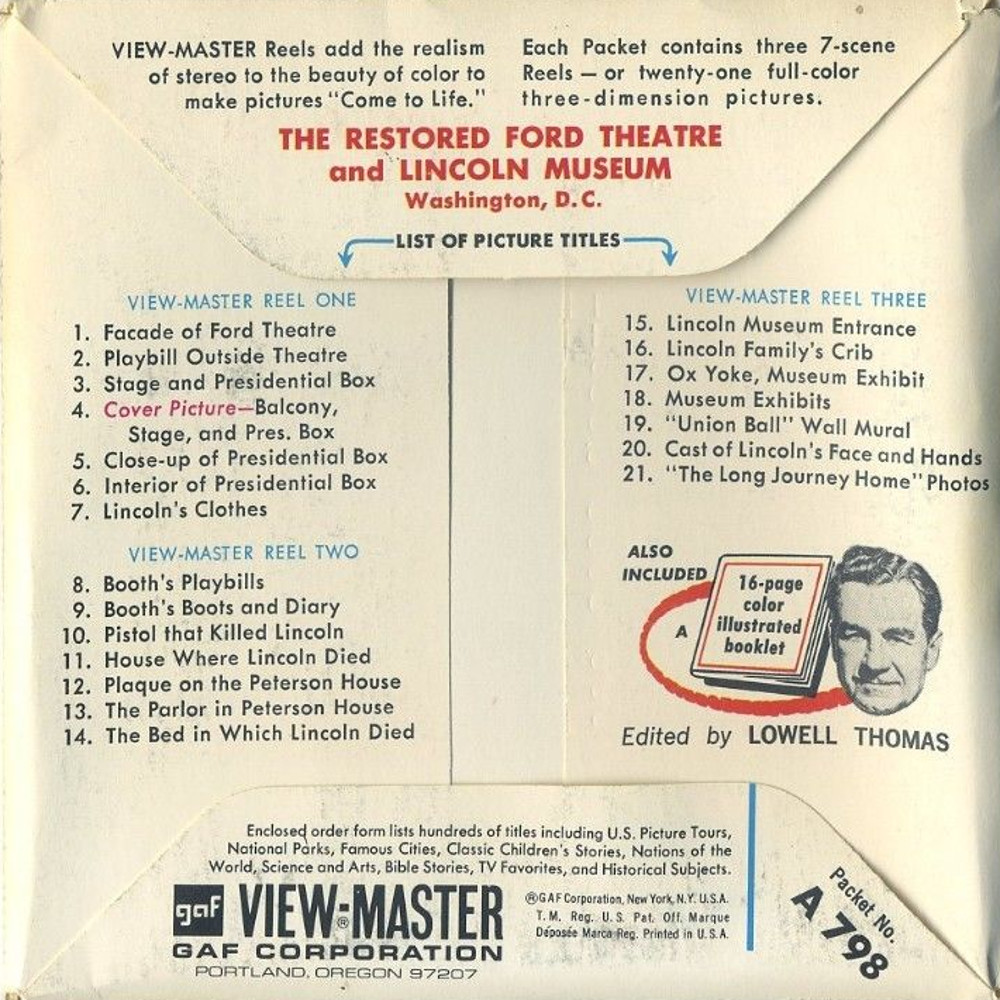
The reverse of the envelope listed the titles of the three reels in the packet and advertised other View-Master titles in the same general subject category.
A new alphanumeric packet/reel numbering system was instituted beginning with the S4 style. The packet number comprised an alphabetic character (A, B, or C) followed by three digits; reels within a packet were identified with the addition of a fourth digit (1, 2, or 3). For example, packet B656, Moon Rockets and Guided Missiles, consisted of reels B6561, B6562, and B6563.
SU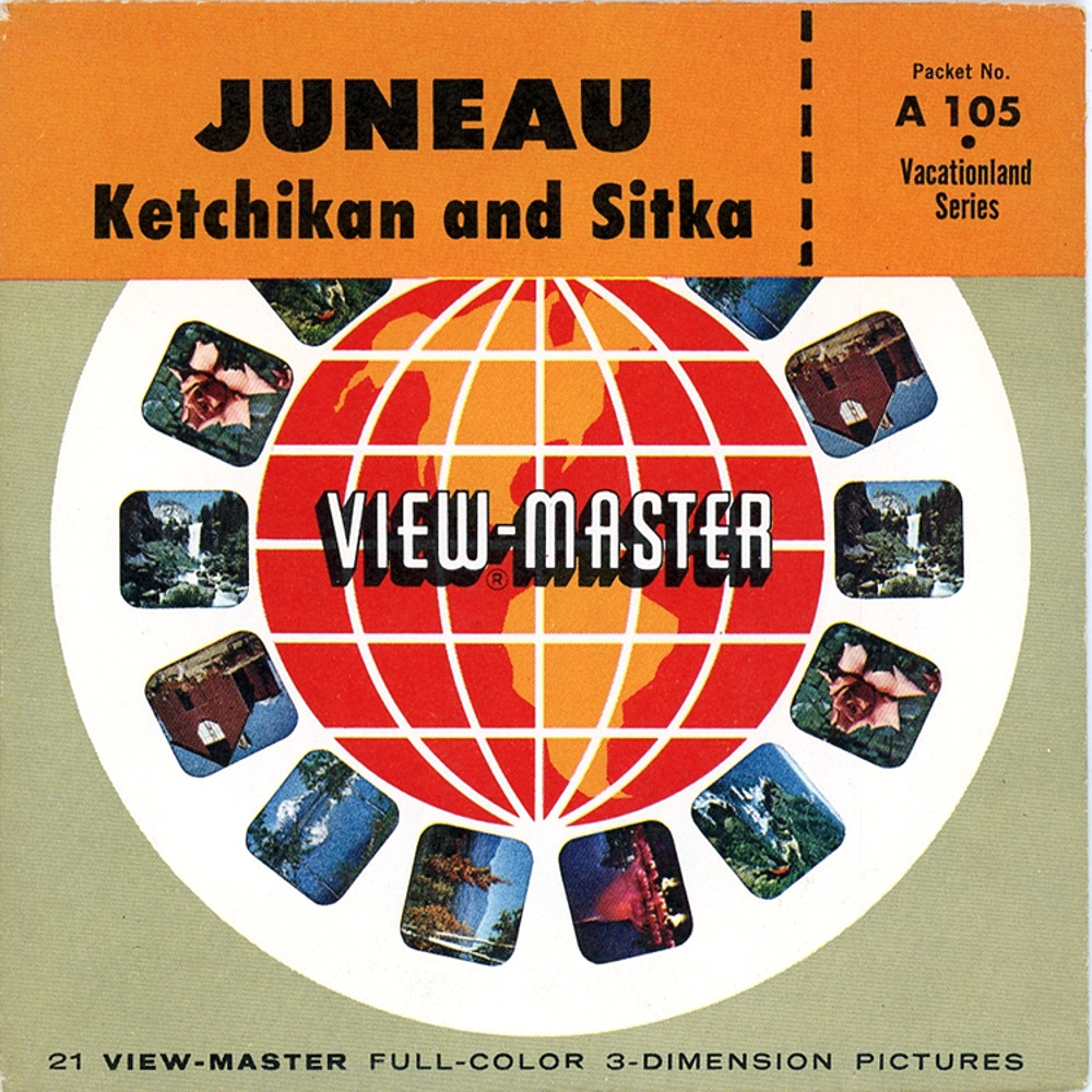
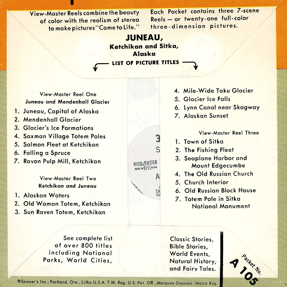
Juneau, Ketchikan, & Sitka A105The "Sawyer's Universal" variant was a generic packet design, used as a stop-gap when a new or revised packet needed to be shipped but new cover artwork had not yet been created.
The packet front featured a stylized View-Master reel with random images in each cell, unrelated to the packet subject; at the center of the reel was a general slogan, such as "Scenic America Series " or, simply, "View-Master." Only the typography was related to the packet contents; this included the packet title and number on the front and, on the reverse, a description of the packet contents. The background color of the front title area was orange; the background color in the lower portion of the envelope front typically was olive green often verging on grey, but pale yellow examples are also known.
SU packets were contemporaneous with the S4, S5, and S6 variants and share the physical and design characteristics of standard packets from the period in which they were issued.
Also known, but very uncommon, are SU-style envelopes with no title or number in the upper-front orange area and no text on the reverse. These may have been blanks provided to View-Master dealers for repackaging of damaged packet stock or for assembling older single reel stock to sell as 3-reel sets.
S5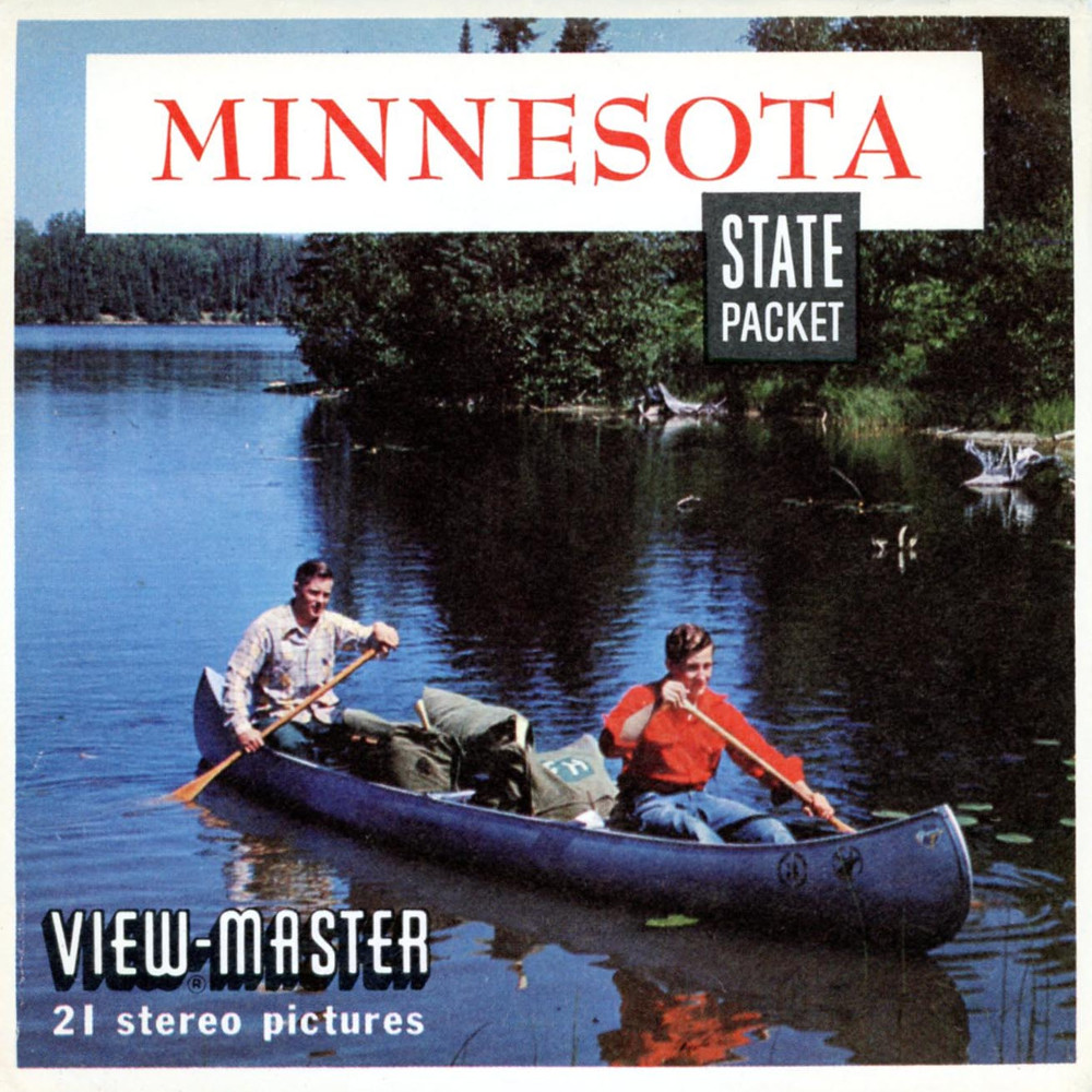
Minnesota A510With the S5 packet style the cover photograph broke out of the frame imposed by the previous S3 and S4 designs to occupy the full face of the envelope; many collectors consider this to be the high point of View-Master packet design.
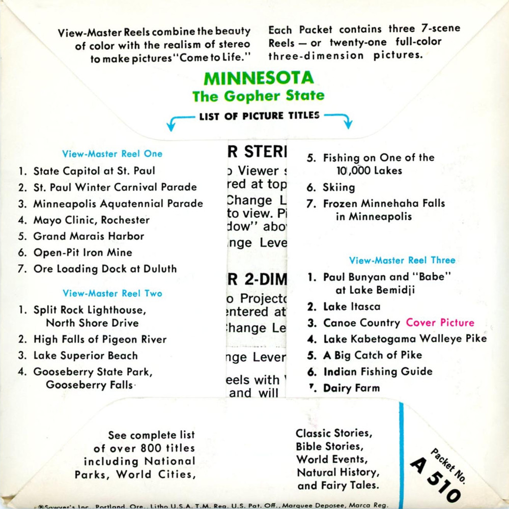
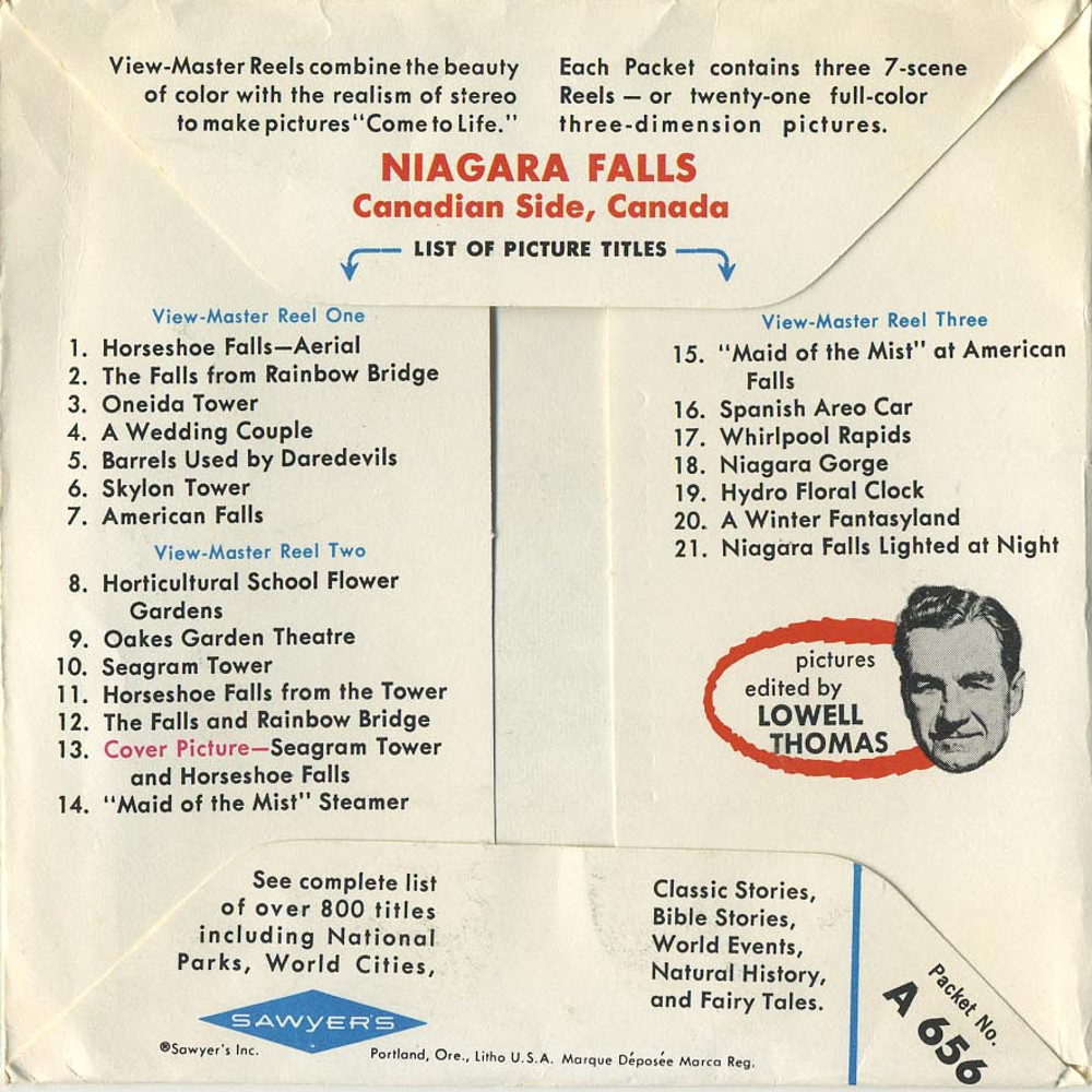
Typography was minimized on the packet front, to avoid detracting from the cover image. Most covers included only the packet title and the slogan "View-Master 21 stereo pictures," uniform from packet to packet and again employing the art décoratif V-M logo. All other textual elements were moved to the back of the envelope; these included the packet number (set diagonally at the lower right), a list of all the packet's 21 images, and promotional copy for other subjects in the View-Master catalog.
Unlike all earlier packet designs, the S5 envelope back had an open gap approximately 1/2 inch wide. Each shrink-wrapped packet contained a reel/packet list the purchaser could use to order additional titles by mail directly from Sawyer's. This order form was packed with a leaf of carbonized paper rearmost in the envelope; a code number was stamped onto the form through the envelope gap as a packet was prepared for shipping to a retailer. The code uniquely identified the dealer so that, if the mail-order form was used for a direct purchase, a portion of the sale could be credited to the dealer's account with Sawyer's.
The physical design of the envelope introduced in the S5 period, including the open gap on the reverse side, persisted until the introduction of blisterpack packaging in the early 1980s.
SX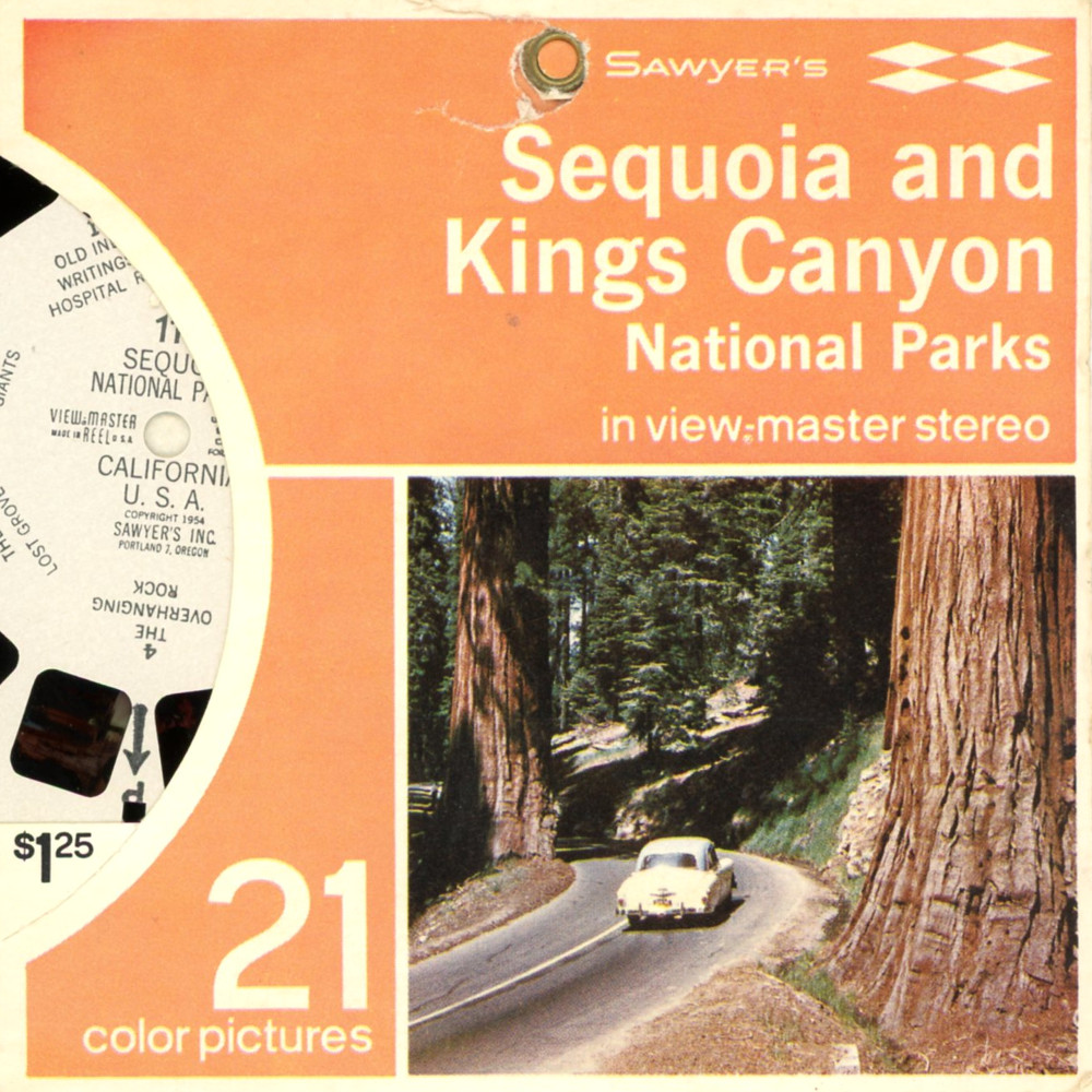
Sequoia & Kings Canyon National Parks A174Also known among collectors as the "special" (SP), "Sawyer's Hanging" (SH), or "swing-out" packet, the "Sawyer's Experimental" (SX) style is the rarest View-Master packet design. Contemporaneous with the S5 variant, it was intended to be the succeeding generation of View-Master packaging.
The package was a square, two-compartment cardstock sheath enclosed only by the fold on the bottom edge; otherwise the left and right edges were completely open and the top edge was held closed only by a central metal eyelet.
The three reels were held in cellophane sleeves inside the front compartment, anchored to the sheath by the eyelet. The sleeves pivoted around the eyelet, so the reels could be swung out for examination by prospective buyers; to satisfy retailer requests, the eyelet also enabled hanging displays. The rear compartment contained a mail-order reel list form; it may potentially have held a booklet, but none of the few titles issued in this format are known to have included booklets.
The front of the packet was laid out in three blocks. The packet title, Sawyer's logo, and the slogan "in view-master stereo" (all lower-case characters) occupied an area slightly less than half the top front; a full-color image from the reels was set at the lower right, comprising only about a third of the cover's total area; and the slogan "21 color pictures" appeared in the lower left. The standard price at the time for a 3-reel packet, $1.25, was preprinted on a perforated tab (presumably for easy removal by gift-givers or by retailers charging non-standard prices).
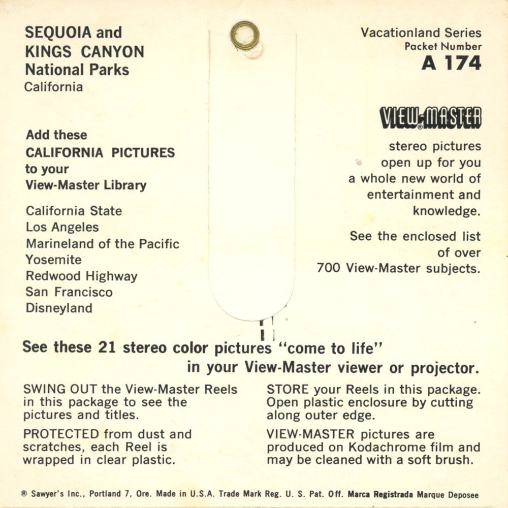
The back of the packet included the title and packet number in, respectively, the upper left and right corners. A brief list of other subjects in the View-Master catalog appeared on the left below the title; the art décoratif V-M logo and general promotional copy appeared on the right beneath the packet's number; instructions appeared at the bottom. A die-cut tongue ran vertically down the center from the top to accomodate the stamping of dealer codes onto enclosed reel lists.
The SX packets were manufactured for a few popular View-Master titles (known subjects include Disneyland and Carlsbad Caverns, Grand Canyon, Yosemite, and Yellowstone National Parks) and sold only in selected test markets. The experiment was soon abandoned; although ingenious in meeting a variety of demands, the design was too vulnerable to damage and pilferage and proved impractical in high-volume retail settings.
S6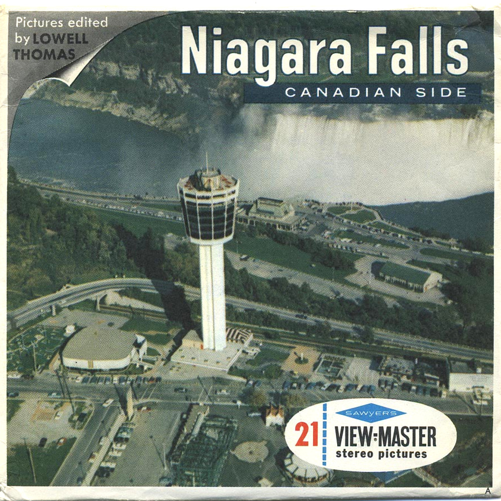
Niagara Falls, Canadian Side A656The S6 packets continued the full face artwork of the S5 style and were characterized by a white oval containing the View-Master logo, the words "21 Stereo Pictures," and the Sawyer's blue diamond logo.
S6 packets were the first to bear an edition mark, a capital letter located in the extreme lower right edge of the packet front, in the white border outside the artwork; in many, but not all, cases the reels also carried edition marks. The edition referred not to the packet design, but to the images on the reels within; a given title may have gone through several packet style revisions but still remain the same edition because the reel images remained unchanged. Most, but not all, S6 packets had an edition mark.
Sawyer's began to shrink-wrap View-Master packets in spring 1964, a practice that continued until the end of envelope-based packaging in the early 1980s. Virtually all S6 packets, and the large remaining inventory of S5 packets at the time, were originally issued in shrink-wrap. Such packets are occasionally still found today fully sealed, their contents untouched since they were shipped from View-Master's Portland facility.
G1/G2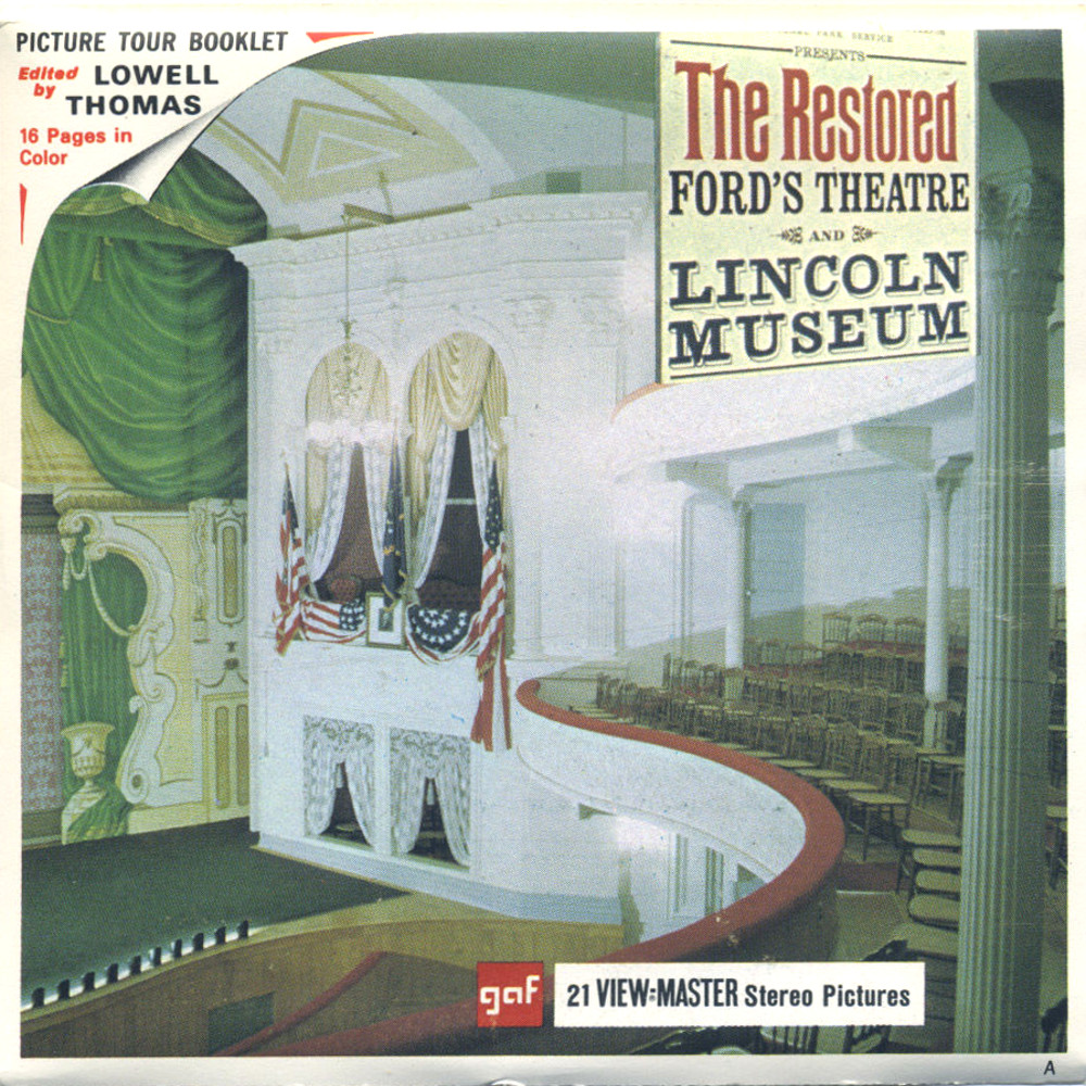
Restored Ford's Theater & Lincoln Museum, The A798The G1 and G2 packets retained the full face artwork of the S5 and S6 styles. The principal difference was the replacement of the S6 oval device with a narrow rectangular bar featuring the GAF logo in white lower-case letters against a red (sometimes black) background and the words "21 VIEW-MASTER Stereo Pictures" in black letters against a white background.
The only difference between the G1 and G2 styles was found on the reverse of the packet envelope. On the bottom flap of G1 envelopes the GAF logo appeared on a black background and the corporate address was listed as Portland, while on G2 envelopes the logo had a red background and the address was New York. (Differences between the G1 and G2 variants are so negligible that many collectors, dealers, auctioneers and this database make no distinction between them)
Perforations along the folding lines of packet envelopes were first introduced with the G1 style. Why GAF chose this method of production is unclear; perhaps perforation expedited machine folding of envelopes. Whatever the reason, perfs are the bane of View-Master collectors because, even with careful handling, over time envelopes separate along their edges. Partially or completely separated top flaps are inevitable on G1 through V2 packets; the problem is so bad that detached top flaps are found even in "MNO" (mint never opened) packets still in their original shrinkwrap.
G3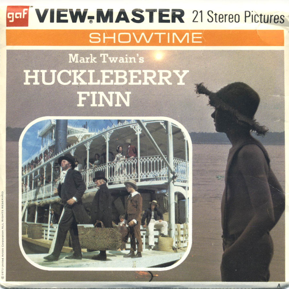
Mark Twain's Huckleberry Finn B343The G3 style set the basic design for View-Master packets until the introduction of blisterpack packaging. Subsequent designs from GAF and View-Master International through the early 1980s introduced only minor variations to the basic format of the G3 packet.
Three elements comprised approximately the top 20% of the packet's cover. The lower-case GAF logo was placed in the top left corner and the slogan "21 Stereo Pictures" appeared immediately to the right. Below both, a general subject category was set in white letters on a narrow colored band spanning the cover. Each subject category was assigned a specific color.
A full-color photograph or montage occupied the remaining area of the cover; the packet title was superimposed upon the image. The back of the envelope was unchanged from the preceding G2 style.
Subsequent G4, G5, and G6 packet variants retained the layout of the G3 design and varied only in details found at the top front of the envelope and on the lower flap of the envelope's back:
G4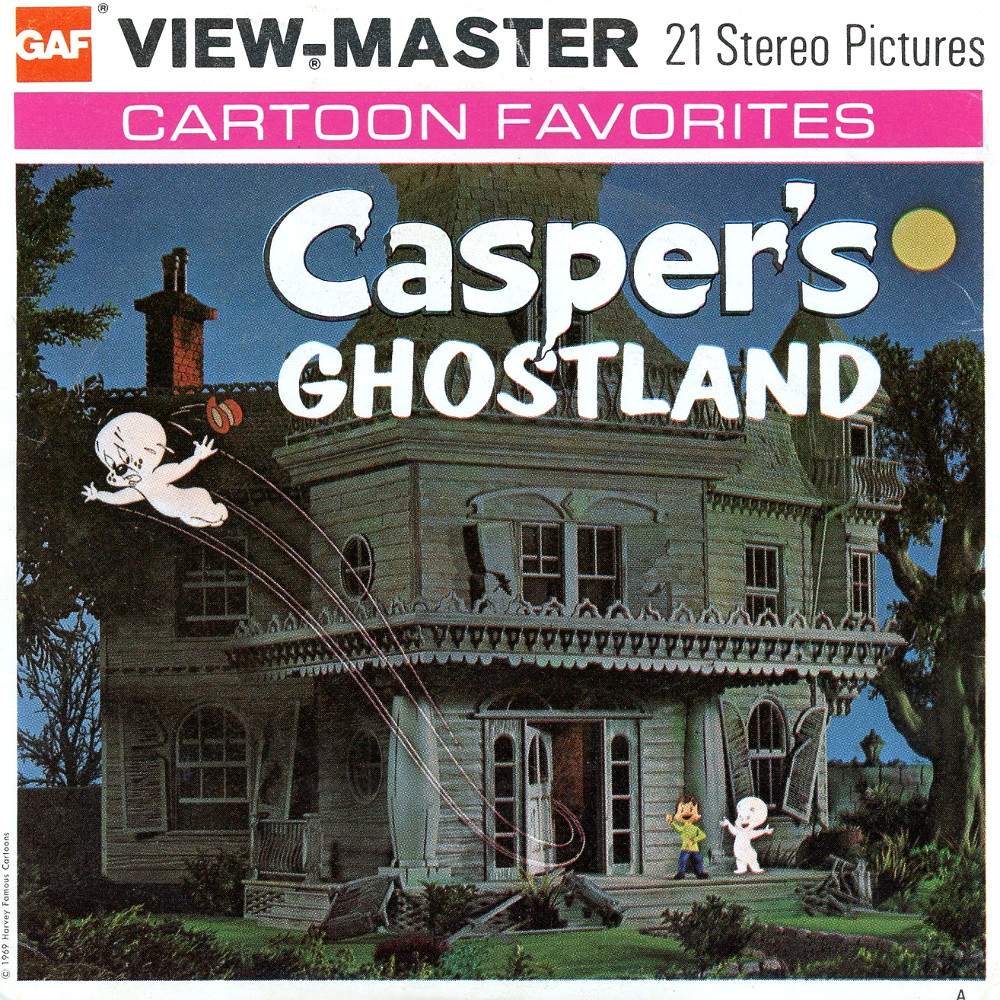
Casper's Ghostland B545The G4 style is nearly identical to the preceeding G3, with the exeception of the GAF logo being in uppercase letters.
G5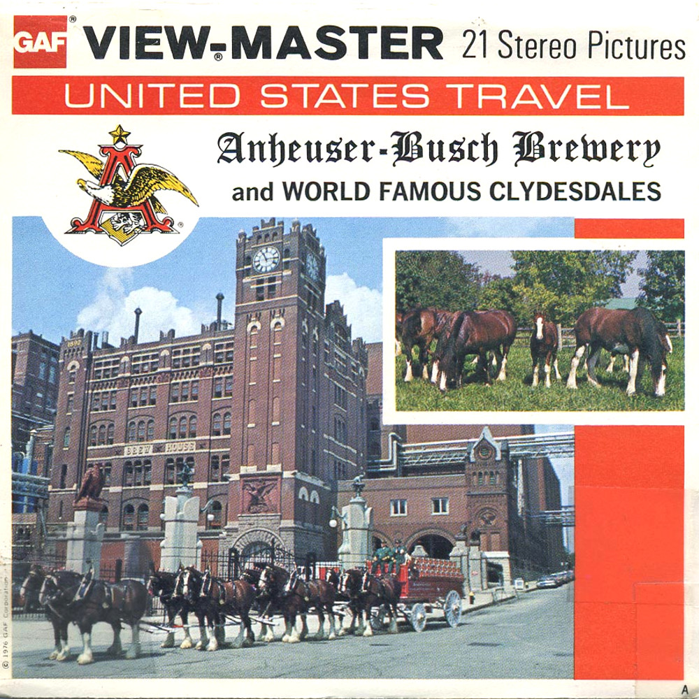
Anheuser-Busch Brewery & World-Famous Clydesdale Horses A460The G5 style is nearly identical to the preceeding G3 and G4 variants. The GAF logo uses uppercase letters. On the back, the corporate address is centered and the copyright information is printed diagonally and to the left.
G6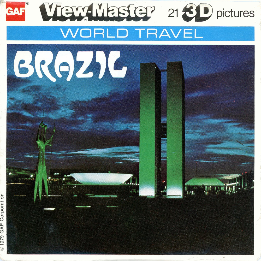
Brazil K41The G6 style is nearly identical to the preceeding G3, G4 and G5 variants. The top front of the packet introduces a few minor changes - View-Master is written in a new three dimensional font and "3D" replaces "Stereo" in slogan. These same changes are also seen in the corporate address on the back.
GO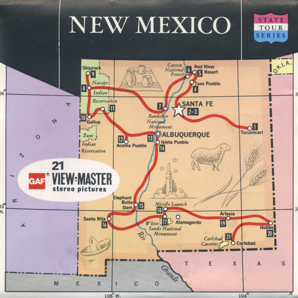
New Mexico A375The GO packet style features an upper case GAF logo inside a white oval, looking very similar to the S6 style (and the Belgian BG1). This design was used exclusively for the black state tour packets that were
reissued in the mid-1970s. In most cases, a booklet was no longer included. Collectors sometimes refer to this style as "S6c" due to its similiarity to the S6. The design was likely used as a cost-saving measure.
V1/V2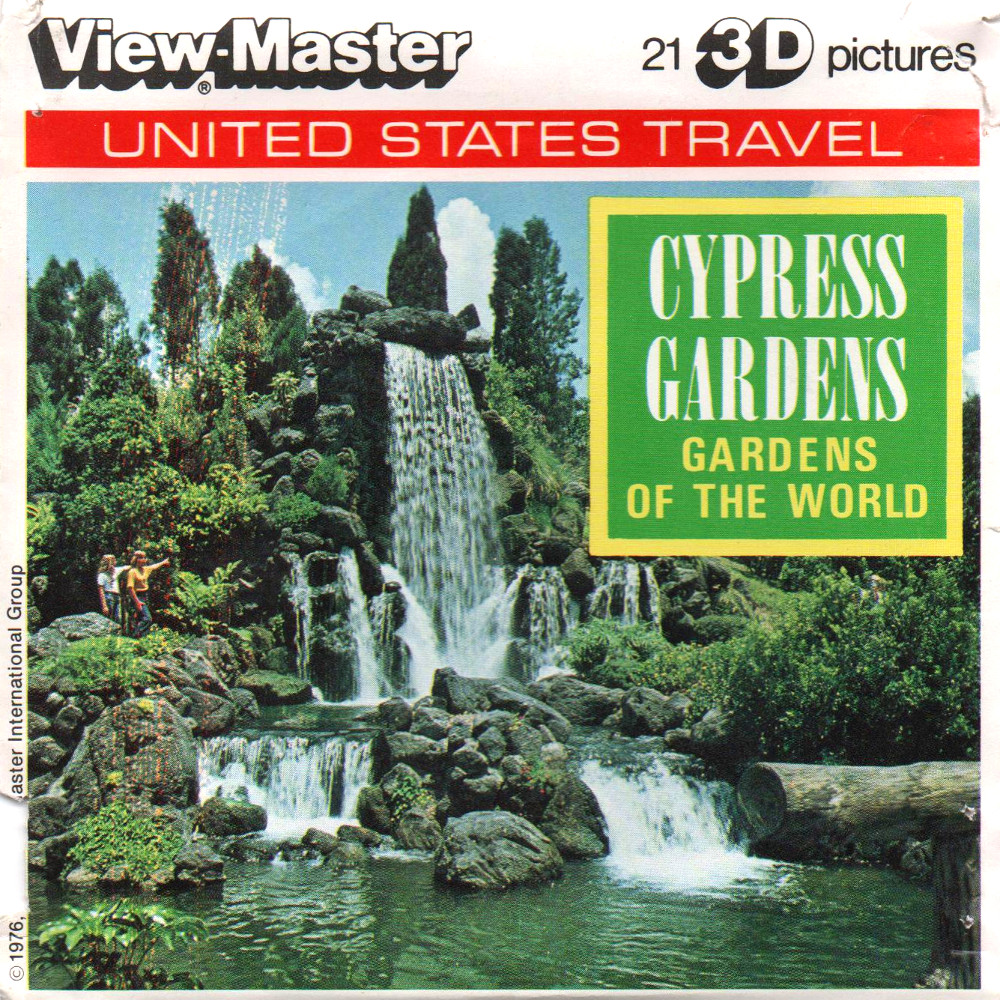
Cypress Gardens, Gardens of the World A999The V1 and V2 variants were the result of View-Master's sale by GAF to a group of independent investors and the company's reconstitution as View-Master International.
The V1 style represents the transition from GAF to VMI ownership and is essentially identical to the immediately preceding G3-G6 variants; the only difference is the deletion of the GAF logo from the front and back of the packet envelope and a change in corporate identification and address on the rear bottom flap. These packets often still list GAF in the copyright and corporate address areas.
The V2 style is the principal variant of the VMI era prior to the introduction of blisterpack packaging.
The V2 variant was the last envelope-based 3-reel View-Master package. In the early/middle 1980s VMI converted to blisterpack packaging, first in the European market and subsequently worldwide. The existing stock of envelope-based packets was stapled to backing cards to make them compatible with the newly-introduced blisterpacks; as a result, many V1 and V2 (as well as G6, G5, G4, and even G3) envelopes are found today with four sets of vertical staple holes along the left and right edges.
Packets for the European market were produced in Belgium. The packet designs were similiar to their American counterparts intitally, however evolved differently under GAF ownership.
BS1/BS2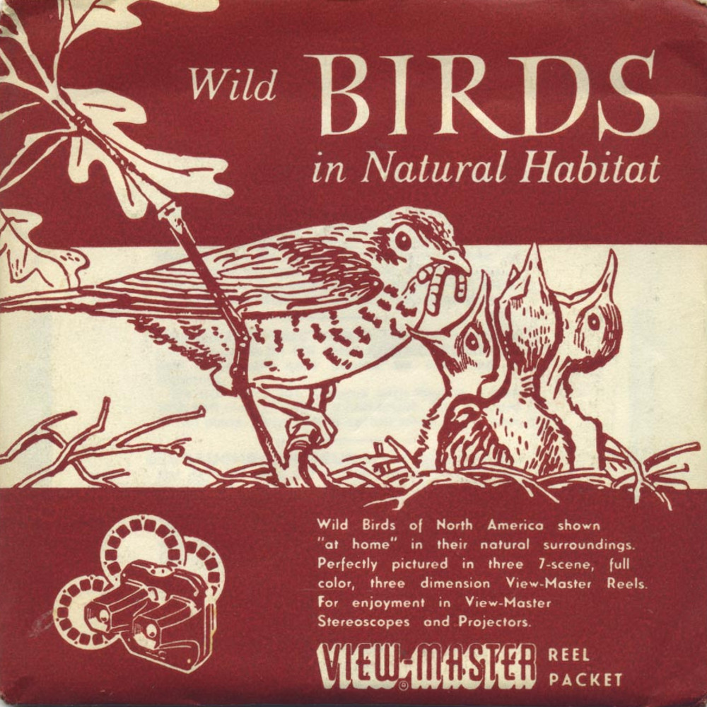
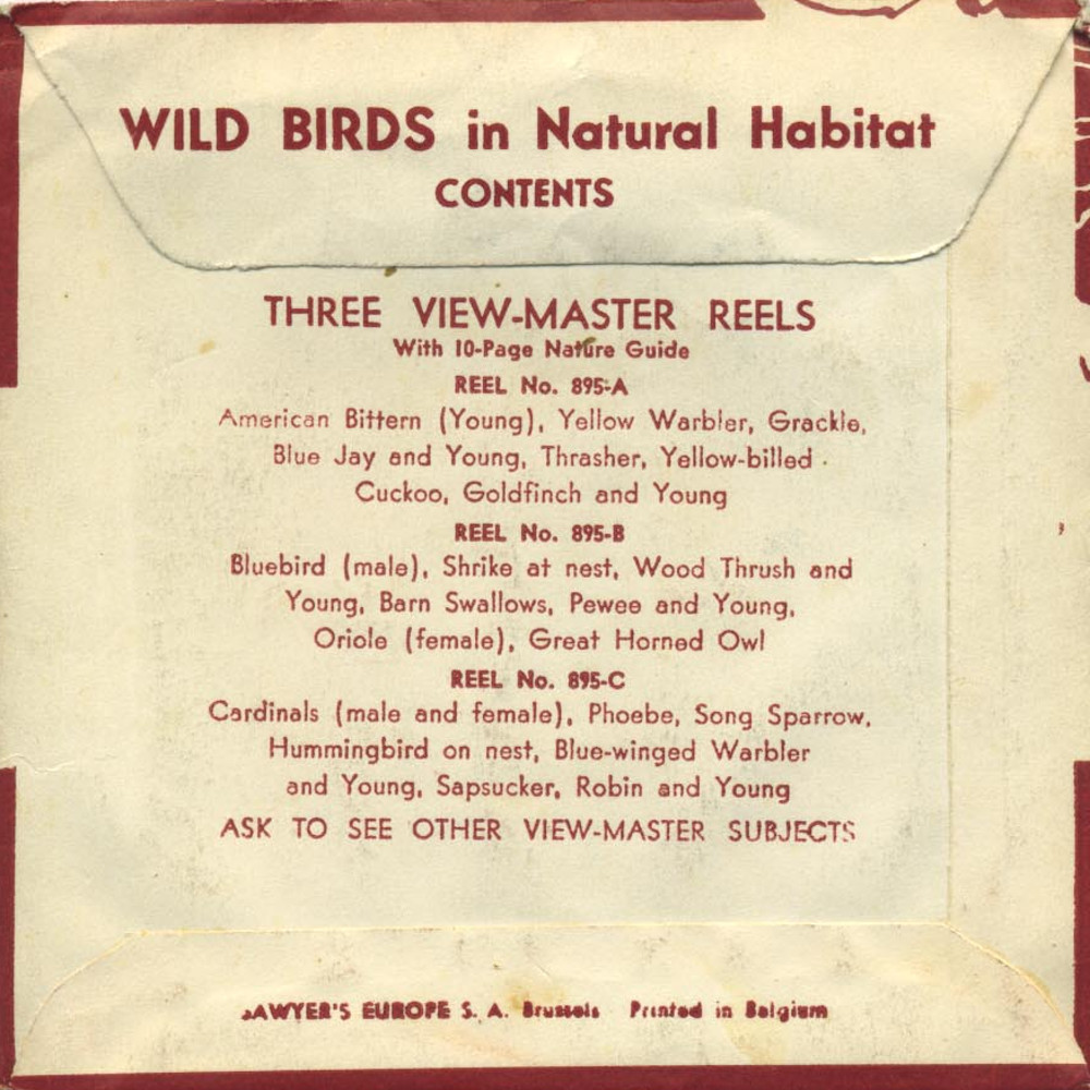
Wild Birds in Their Natural HabitatThe first Belgian packet releases were quite similar to their American counterparts. The back of the packet often included a letter id number along with the numbers of the individual reels,
as these were often compilations. "Sawyer's Europe" was printed at the bottom.
BS3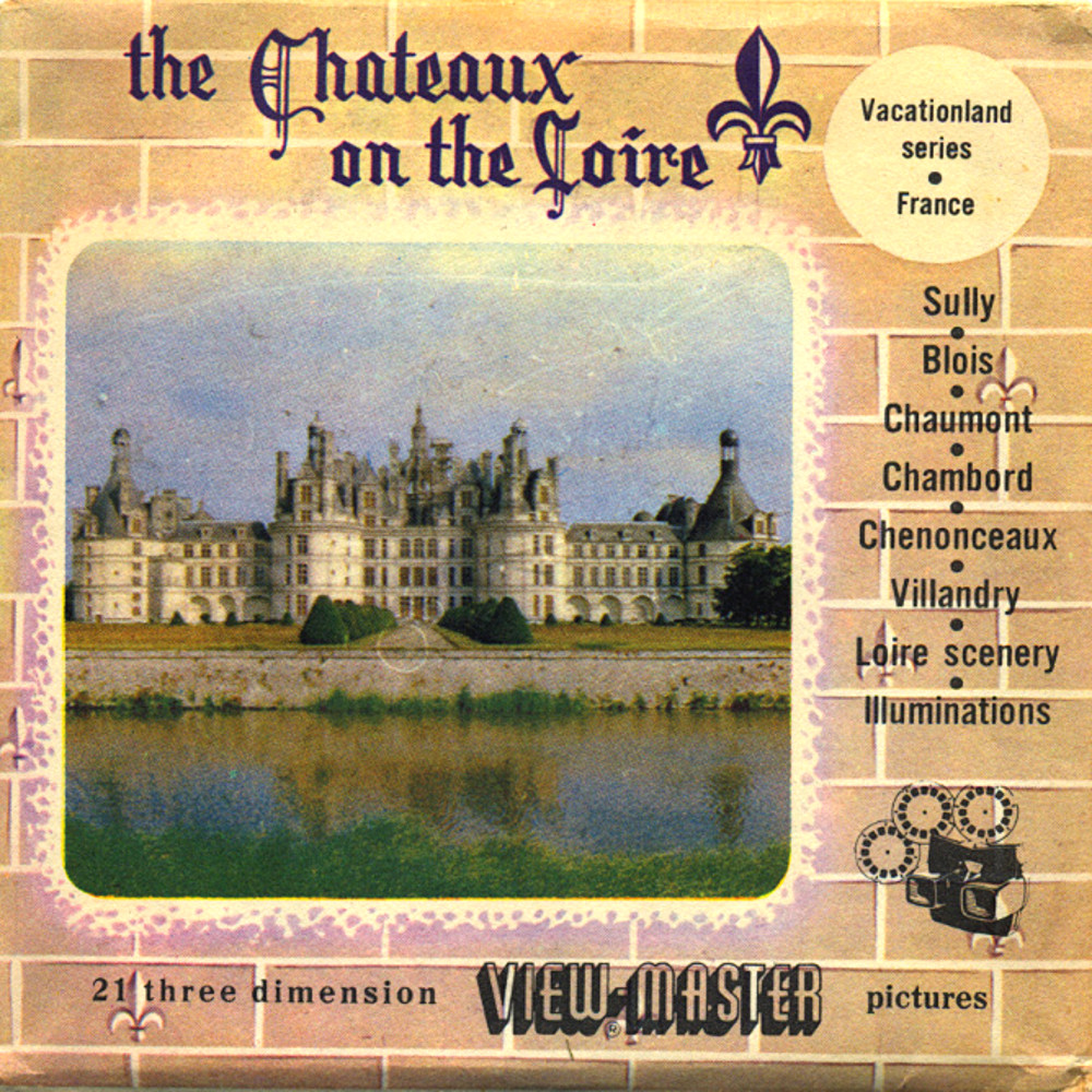
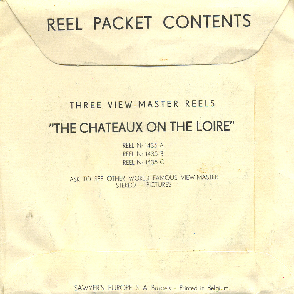
Chateaux on the Loire, TheThe BS3 layout included a left-aligned picture window surrounded by the packet title, a solid-color circle displaying a general subject catgory, a textual sampling of the packet contents, a drawing of a View-Master viewer against
a background of three reel and the slogan "21 three dimension View-Master pictures" incorporating the original View-Master logo. The back of the envelope was mostly empty except for the individual reel numbers, a short flap with "Reel Packet Contents - Three View-Master Reels" printed on it, and copyright information at the bottom. Unlike the American packets, the scenic titles did not include a mailing form on the back. Also, sometimes the packets featured a background design on the front cover instead of just a solid color, such as the brick pattern shown here on "The Chateaux on the Loire".
BS4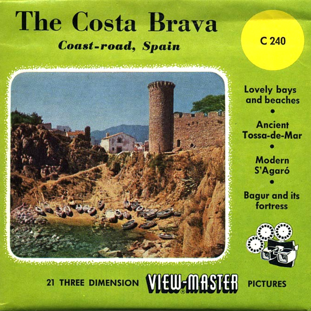
Costa Brava, The C240The BS4 design was not much different from its predecessor. In the front circle, the subject category was dropped and in its place was a View-Master catalog number shown in a simple font.
(The scenic packets originating in Belgium started with the letter C). The back of the packets did not usually include any reel numbers.
BS5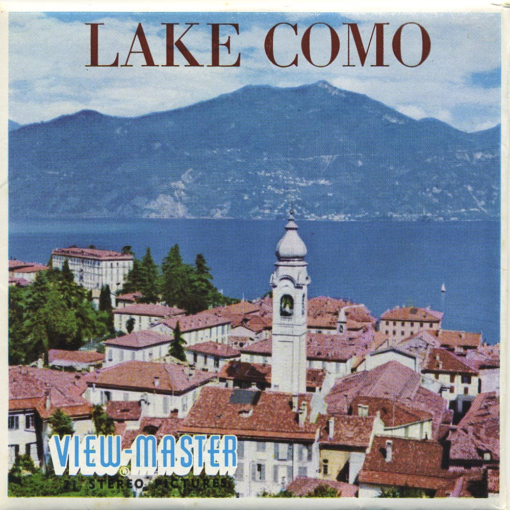
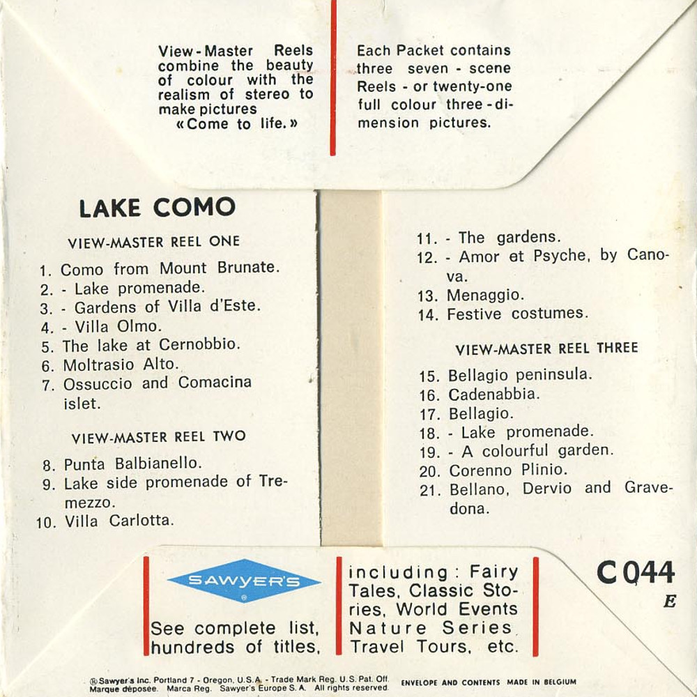
Lake Como C044The BS5 packet style featured a photograph that covered the full face of the envelope front. The packet title and "View-Master 21 Stereo Pictures" were also printed on the front. The packet backs had several variations. Initially they were similar to the BS3/BS4 style, being mostly blank with just the packet number. Sometimes there was also a vertical cut-out with rounded
ends. Eventually, the back design was enhanced with more details. The fictional packets had a story summary and the scenic packets had a listing of all twenty one views. The packet number was printed horizontally in the lower right corner.
Also introduced were small letters, printed just below the packet number, that indicated which language was used.
Please note that since the back variations are relatively minor, the VMDB does not include them in the listings unless the packet fronts were different in some way as well. It was common for BS5 packets to be reissued with
a different font and/or color used for the title.
BS6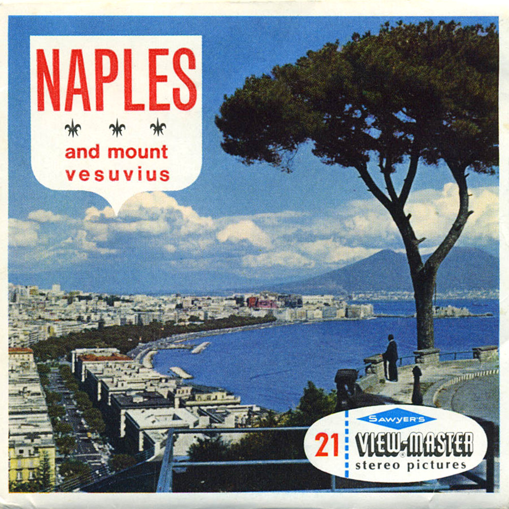
Naples and Mount Vesuvius C031The BS6 design saw the introduction of a white oval on the front cover with the blue diamond Sawyer's logo. The full-face cover art from the BS5 continued, along with the envelope back variants, however
the enhanced design became the most commmon.
BG1

Swiss Alpine Passes C127When GAF took over ownership of the View-Master product, the packet designs were not changed very dramatically. The white oval was kept, while the "21" was moved to the top replacing the blue Sawyer's
diamond and the GAF logo was placed where the "21" was.
BG2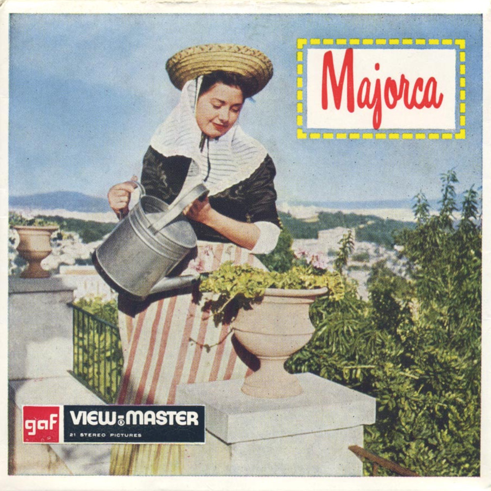

Majorca, the Balearic Islands C241The BG2 is nearly identical to the previous style. GAF logo is now shown in a rectangle instead of the white oval and "View-Master" printed in white on a black background.
BGU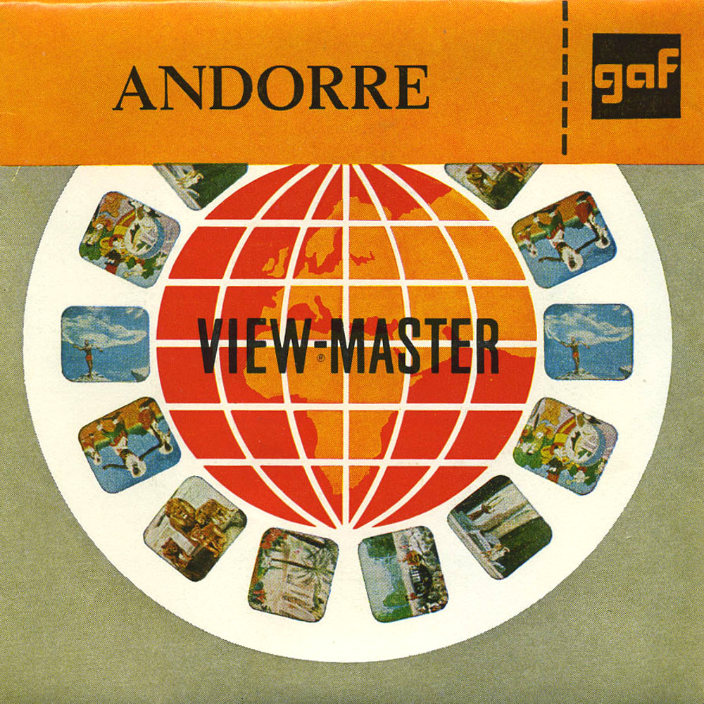
Andorre C235The BGU design is similiar to the American SU. It is a generic packet design featuring a big reel on the front cover with random images on it. The top of the cover has an orange stripe with the title
and catalog number or GAF logo. These generic covers were used as a temporary measure when product was needed but there was not enough time to assemble a regular one.
BG3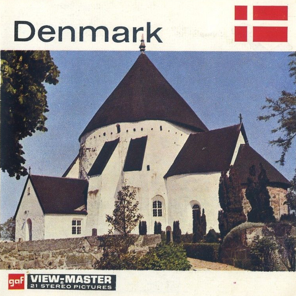
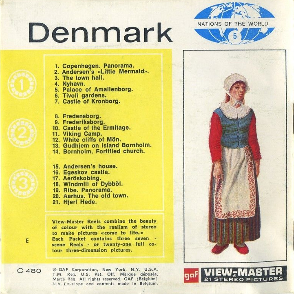
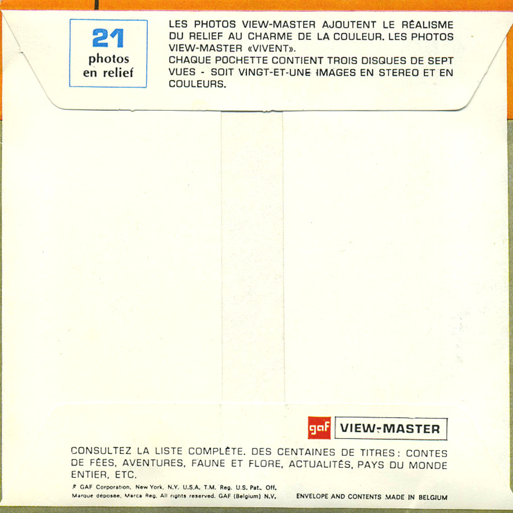
Denmark C480The BG3 was a premium format package and contemporaneous with the North American G1, G2, and G3 variants. The design was used for the Nations of the World Series, certain feature film titles, and other subjects deemed worthy of special treatment.
While other Belgian-made packets of the time were issued in the familiar envelope format containing reels, inner sleeve, and (sometimes) a booklet, the BG3 style dispensed with the exterior envelope altogether. The package comprised a sturdier than usual booklet printed on coated paper; the three reels were stored in a cardstock sleeve inside the back cover.
Collectors often refer to this variant as the "packet-book" design.
BG4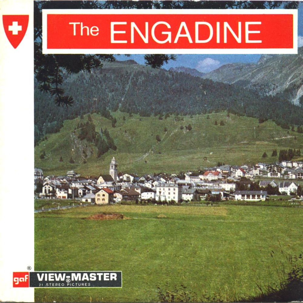
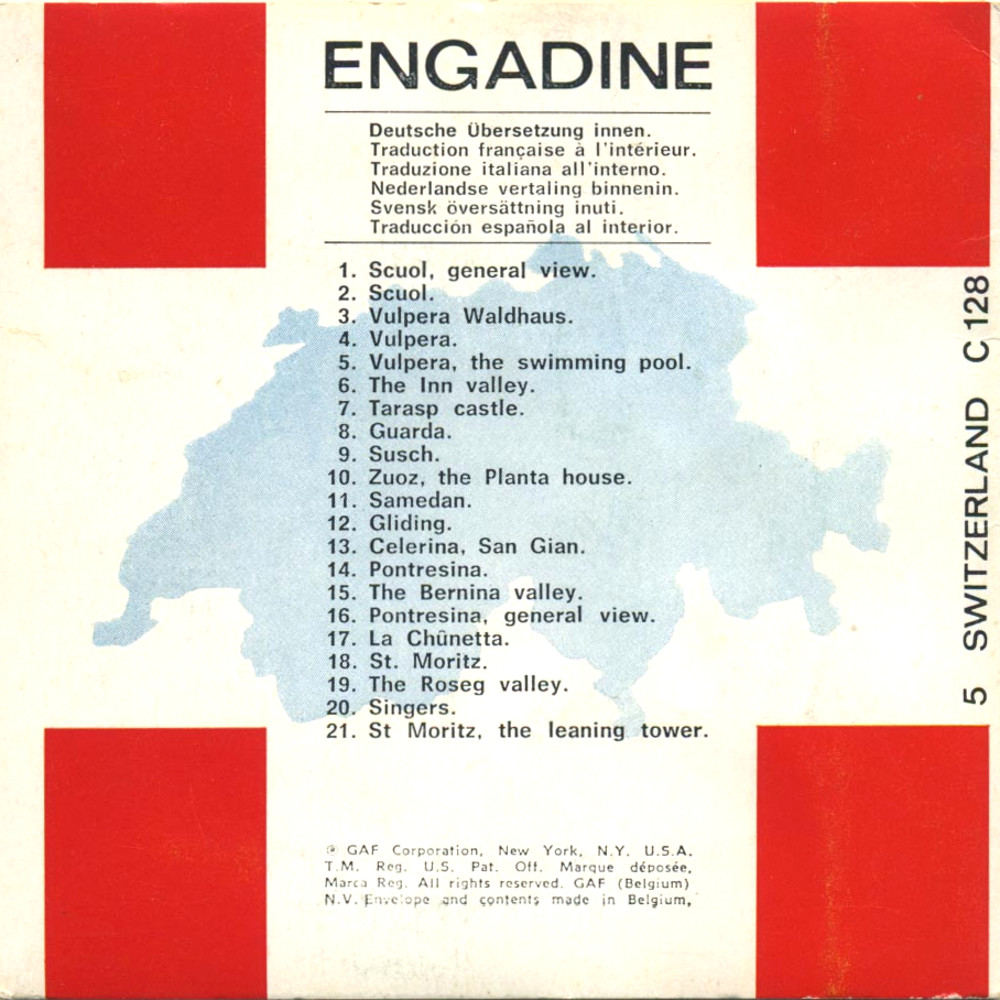
Engadine, The C128The front of these packets are similar to prior variants, however changes were made to the layout and the way languages were handled. The jackets were printed on a rectangular strip and folded to make a square. (Collectors often call this design "tri-fold".)
Instead of issuing the packet in a single language, multiple languages were included. The captions on the reels themseleves and the back of the jacket were in one language and other translations were shown when the packet was unfolded. As a result, the language letter was not longer placed on the back cover. In this database, the language listed is the primary one used.
BG5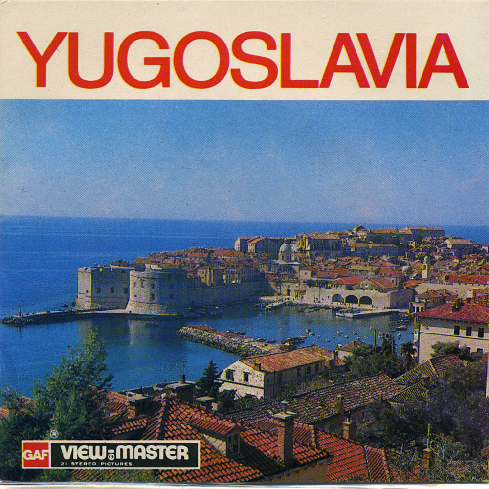
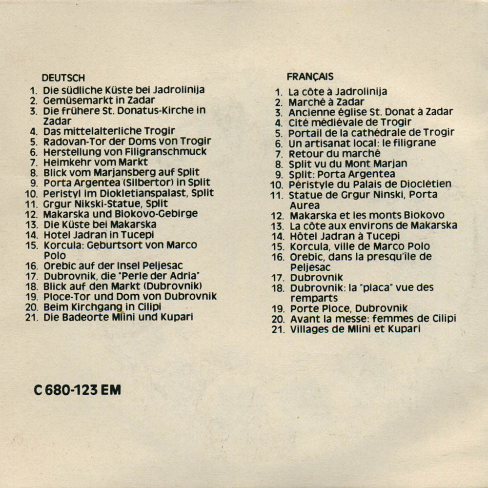
Yugoslavia C680In this design, the upper fifth of the packet front was white and contained the title in red lettering. The red GAF logo was in uppercase letters. Like the previous style, it is also a "tri-fold" and multiple languages were included inside.
The BG5 is quite rare, as it was only produced briefly in 1978 and 1979.
Another Belgian packet design is the BG6, which was a large 8" X 8" folder closer in size to a vinyl record jacket. These titles will be added to the View-Master Database at a later date.